Paper Crane
Paper Crane Goods
Web
2026

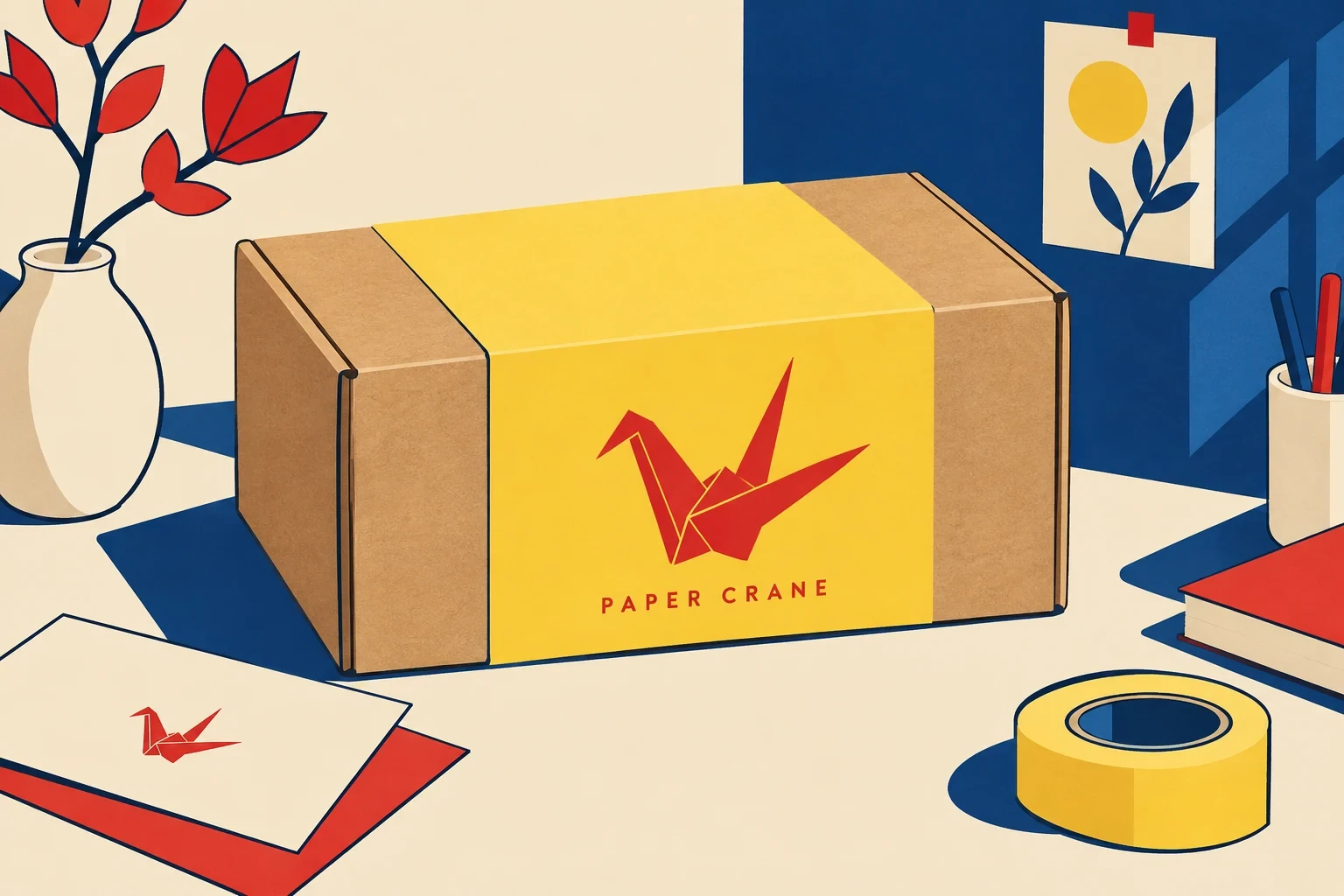


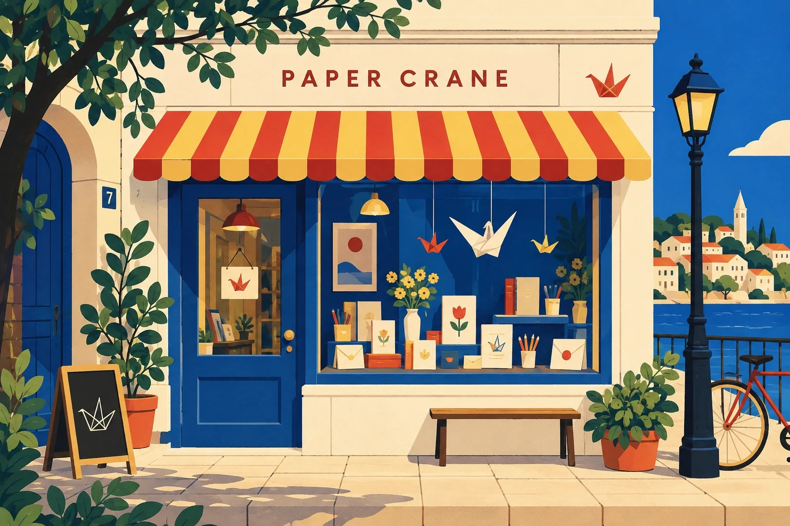
A hand-drawn storefront for paper goods folded, printed and posted in small runs.
Project Info
Client
Paper Crane Goods
Year
2026
Discipline
Web
Paper Crane Goods sells paper objects made in small runs: folded birds, letterpress cards and riso prints posted in a padded envelope with a hand-written note. They were selling through a marketplace template that treated every product as a row in a database. We built a storefront that keeps the hand visible.
The brief
Marketplace templates flattened the charm out of the products. A folded crane photographed on white looks like every other folded crane, and the two people who make them vanish. The shop needed to feel hand-assembled without giving up a serious buying flow.
There was a commercial problem underneath the aesthetic one. Runs are small, between twenty and eighty pieces, and the old shop had no honest way to say so. Customers learned an item had sold out at the payment step.
Drawing the system, not the page
Our first route was photographic: scanned paper, full-bleed texture, real shadows. It looked good at desktop width and collapsed everywhere else. One collection page came in over four megabytes and the texture turned to grey mud on a phone, where two thirds of the shop’s traffic arrives. We dropped it in week two and drew the shop instead. Every mark now comes from one kit of forty-six SVG drawings: rules, arrows, price tags, postal stamps and a crease line that separates sections.
The kit is a system rather than a mood. Each mark has a fixed stroke weight and two permitted sizes, so a new page can be built from existing parts and still read as drawn. We also tested and rejected a scrapbook layout: cards at random angles under a sticker cursor. It photographed well and was miserable to use, because the tilt broke the reading line on a narrow screen and the cursor fought every tap. One angle survived, on the sold-out badge.
What shipped
A twenty-four page storefront covering collections, product detail, the journal and a shipping page written in plain sentences. The drawn kit ships as a component library with five status badges (in stock, low, sold out, restocking, one of one) and matching templates for packing slips and thank-you cards, so the parcel and the site are recognisably the same object.
Stock is stated on the product page as a count against the run, nine left of sixty. Checkout is three steps with no account required, postage shown before the email field and a gift note that prints onto the card packed with it.
What it changed
Completed checkouts rose 24% in the first two months, and the weekly sold-out complaint has not arrived since launch. The drawn kit keeps the site light: an average product page weighs 380 KB. The part we keep thinking about is smaller. Because the templates are shared, a new run goes live in about twenty minutes, so the shop can sell something folded on a Tuesday afternoon.