Onda House
Onda Hospitality
Identity
2026
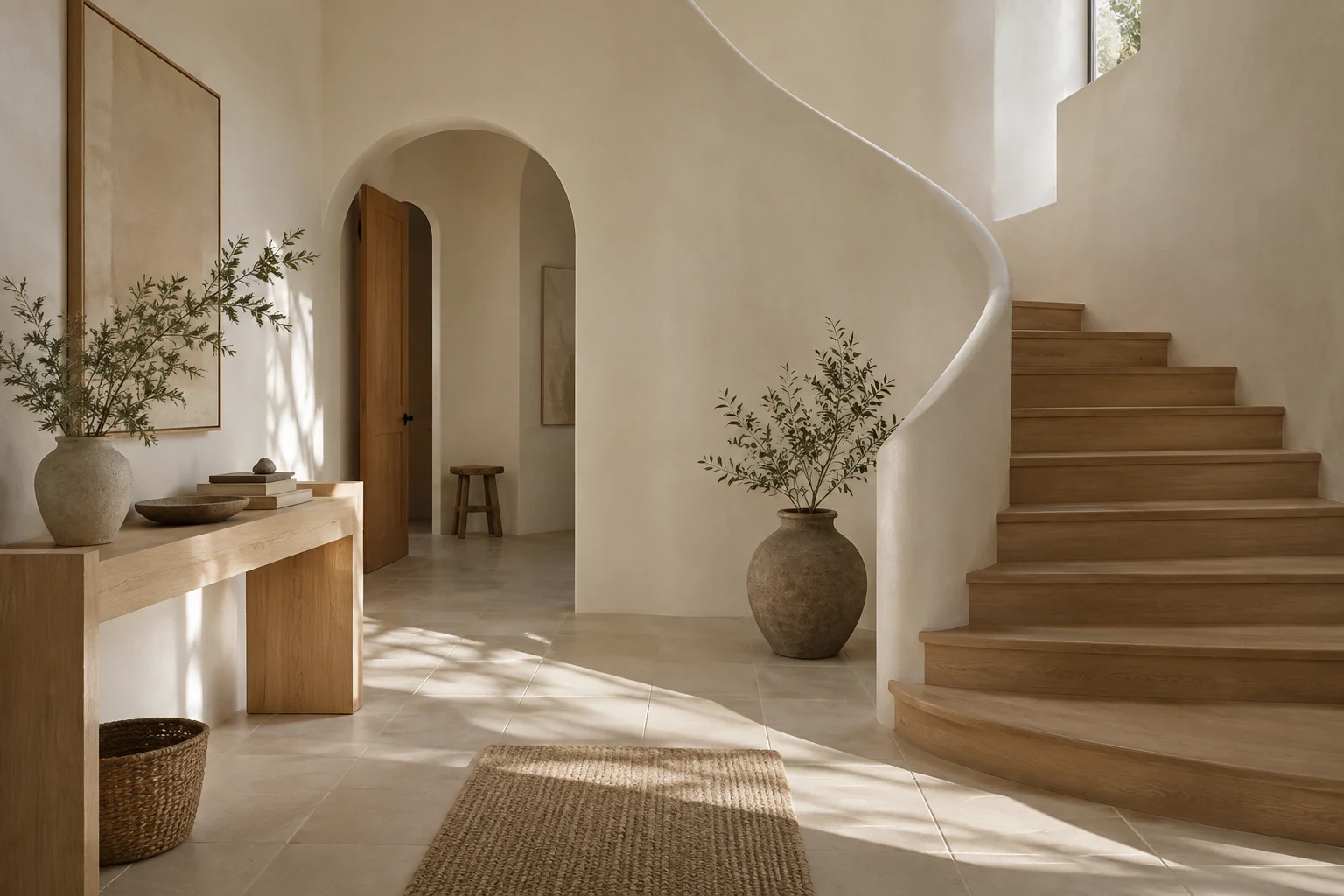
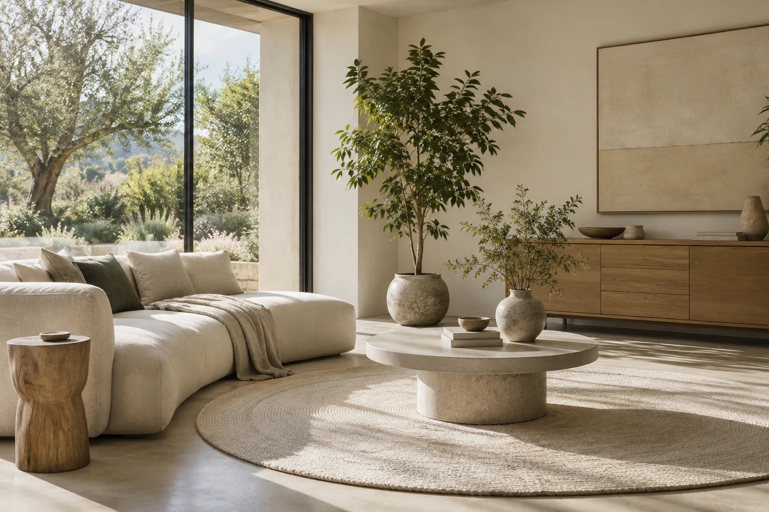

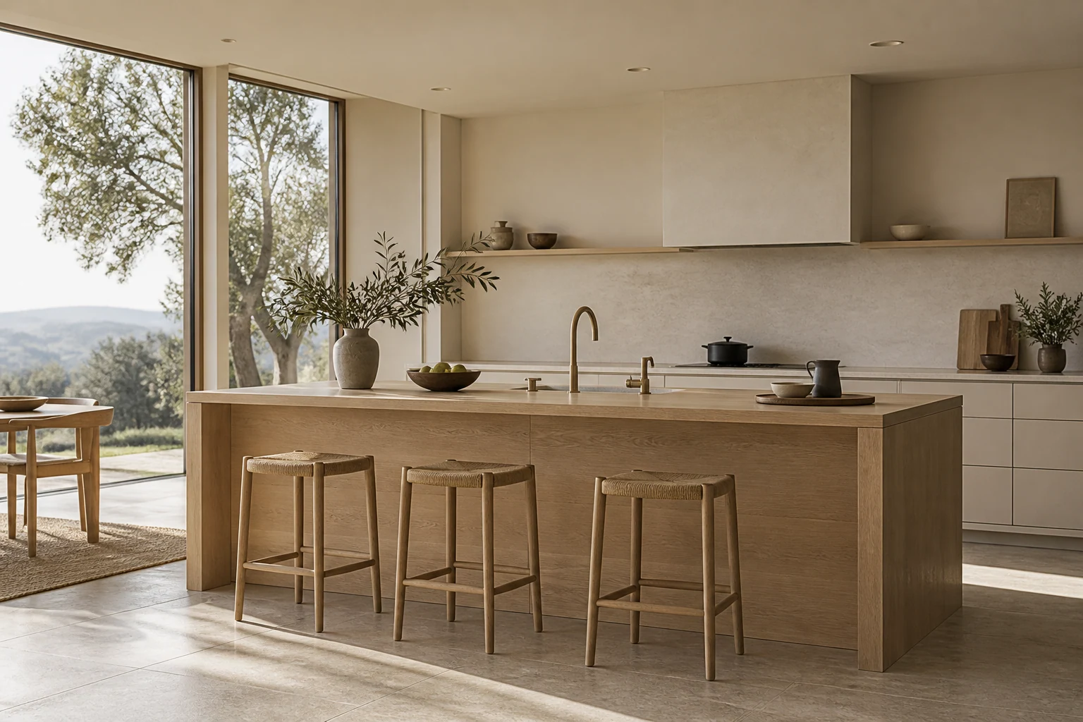
A warm, unhurried identity for a twelve-room guesthouse on the coast.
Project Info
Client
Onda Hospitality
Year
2026
Discipline
Identity
Onda House is a twelve-room guesthouse where the coast sets the pace. The founders had a building, a real sense of hospitality and a booking page borrowed from a platform that took a cut of every night sold. We were asked for an identity that carries a guest from a search result to a set of keys.
The brief
The founders wanted to avoid every familiar boutique-hotel cliché. The system had to feel elevated without becoming precious, and useful enough to guide a guest from first impression to check-in. It also had to be run by a staff of nine who print their own breakfast cards and reorder signage between seasons.
The practical constraint was the air. Everything on site sits within sixty metres of salt water, so print fades, brass dulls and vinyl lifts within a season. We treated replacement as a design condition: anything that would not survive a year had to be cheap enough to remake in an afternoon.
How we worked
The first direction leaned on the obvious reading of the name. Onda means wave, and the early marks all curved. They looked like every seafront hotel we have stayed in, so we dropped the motif and went after the feeling instead of the picture. What replaced it is quieter: a wordmark in a low-contrast serif with an open, slightly wide O that behaves like a doorway.
Colour followed the same logic. We proposed a seasonal palette at first, four shifts a year, and dropped it in the second review once the staff walked us through their reprint cycle. Four palettes meant four versions of everything and a stock cupboard nobody could keep straight. The system settled on two inks, a warm chalk and a deep umber, with a sun-bleached terracotta held back for wayfinding.
What shipped
Naming refinements, a wordmark and a monogram, a two-typeface system pairing a text serif with a condensed grotesque for numbers and signage, and colour logic set out in a 34-page guide the team actually uses. Guest touchpoints followed: room plates, key fobs, breakfast cards, a front desk stamp, and signage drawings dimensioned for a local fabricator.
The direct-booking site is the centre of it. Four pages, built to load on a weak harbour signal, with availability visible before a guest is asked for anything. Seasonal offers run on templates the front desk fills in itself.
After the first season
Direct bookings rose from 18 per cent of reservations to 37 in the first season, money that used to leave as platform commission. The part we keep thinking about is smaller. Onda has reprinted the breakfast cards twice and changed the paper once, and never called us. A system that survives its own maintenance is the only kind worth handing over.