Fathom
Fathom Marine
Interface
2025
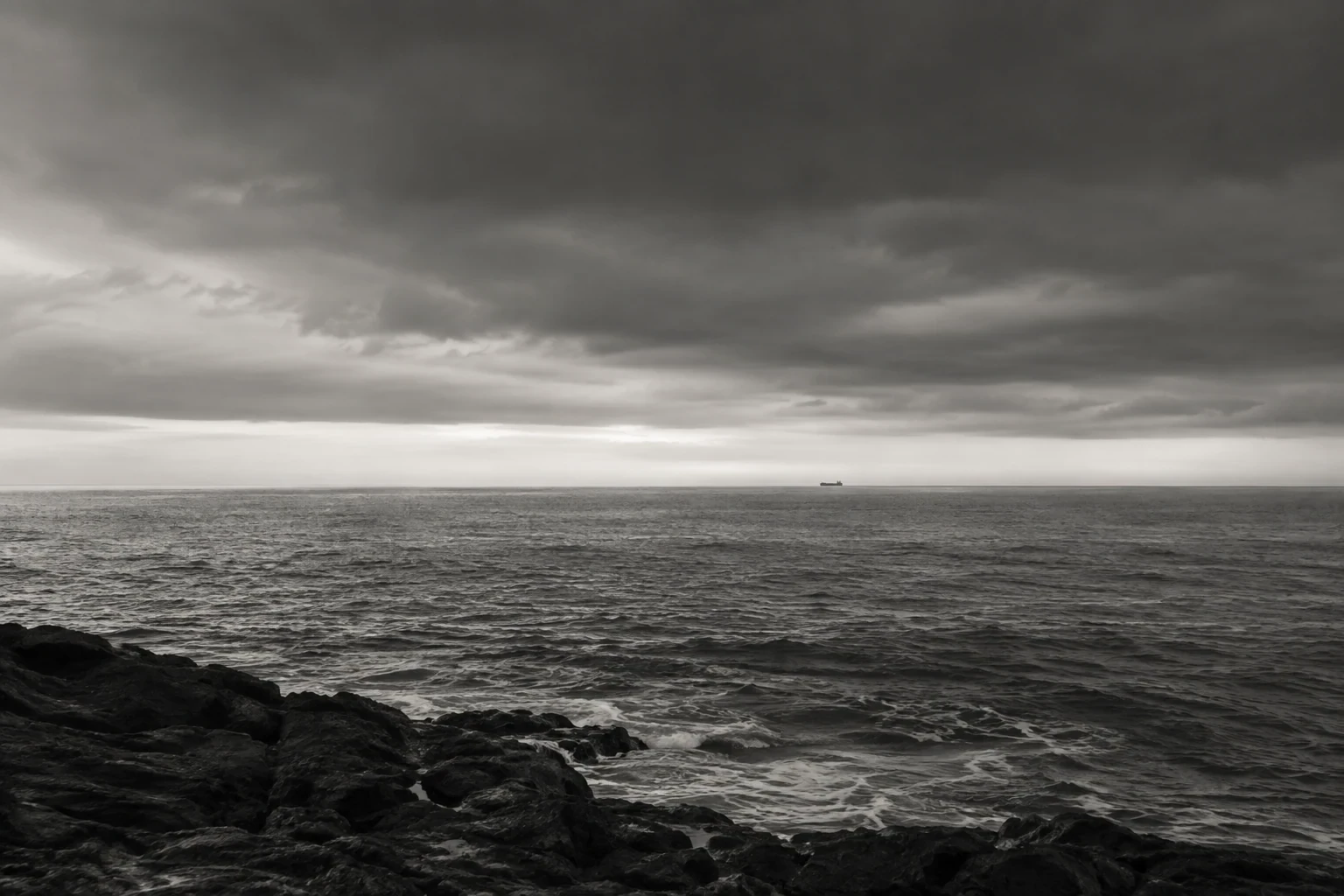

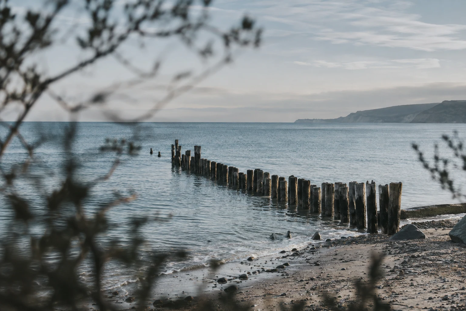

Marine operations software rebuilt so crews can decide fast when conditions are against them.
Project Info
Client
Fathom Marine
Year
2025
Discipline
Interface
Fathom Marine builds planning and monitoring software for offshore support vessels, and its users read it in the worst conditions software ever gets read in: at night, on a moving deck, wearing gloves. It held everything a crew needed and left them to assemble the picture themselves. We reorganised it around the moments when clarity matters most.
The brief
Critical information was scattered across dense dashboards. Crews needed a product language that could prioritise risk, remain legible in difficult conditions and scale from a handheld tablet to a bridge display.
The product had grown by accretion. Nine years of feature requests had left 140 screens, three competing table styles and an alarm red that meant urgent in one module and selected in another. Nobody trusted it enough to act without checking a second source, the most expensive failure a monitoring tool can have.
Designing for the worst hour
We set one rule early: each screen answers a single question, and that question is printed at the top of it. It sounds obvious until you apply it to a legacy product, where it means deleting panels somebody once requested. We ran the rule against the twelve most common tasks, and route assessment collapsed from three screens and two modals into one view with a decision strip along the bottom.
The bridge shaped everything after that. Displays run in night mode to protect the crew’s vision, so severity could never be carried by colour alone. Our first prototype used a five step colour scale and failed its first onboard test within the hour: under red light the top three steps were indistinguishable. We rebuilt severity as position, weight and a written value, with colour reinforcing the ranking rather than carrying it. Bandwidth was the other limit: every reading carries its own age, and the interface says plainly when numbers are stale.
What shipped
A redesigned operations interface across 64 screens, a resilient component system with tokens shared between design files and code, interactive prototypes tested onboard with working crews, and motion rules for changing states.
Around it sits the practical layer: a night mode built for red light, 56 pixel minimum touch targets for gloved hands, a data freshness pattern used in every module, and a motion sheet capping transitions at 180 milliseconds, with alarms exempt from animation. Fathom’s engineers took over the component library in the second month and have extended it without us since.
What we took away
The new workflow cuts route assessment from minutes to seconds. In testing with 14 operators across six vessels the median fell from four minutes to thirty eight seconds, and tickets tagged as misreading dropped by half in the first quarter. Legibility is a safety feature: when the room is dark and the deck is moving, every design decision is really a decision about how fast somebody can be certain.