Wavelength
Wavelength FM
Motion
2024
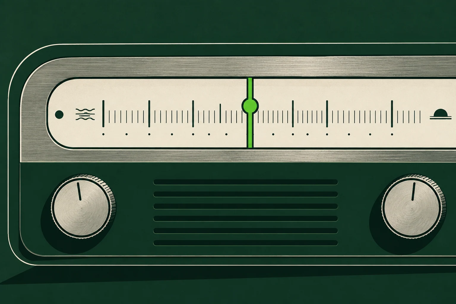
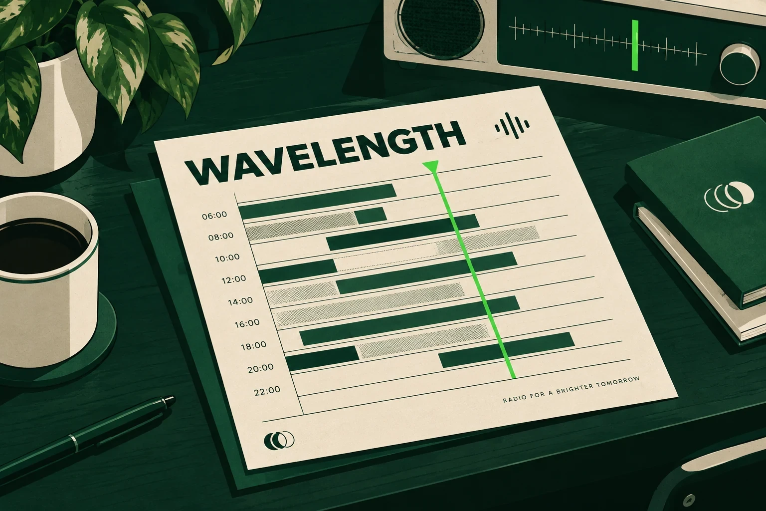
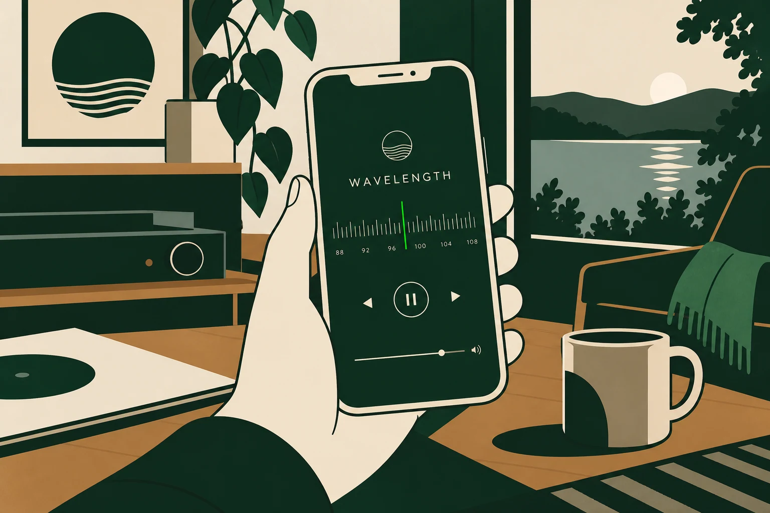
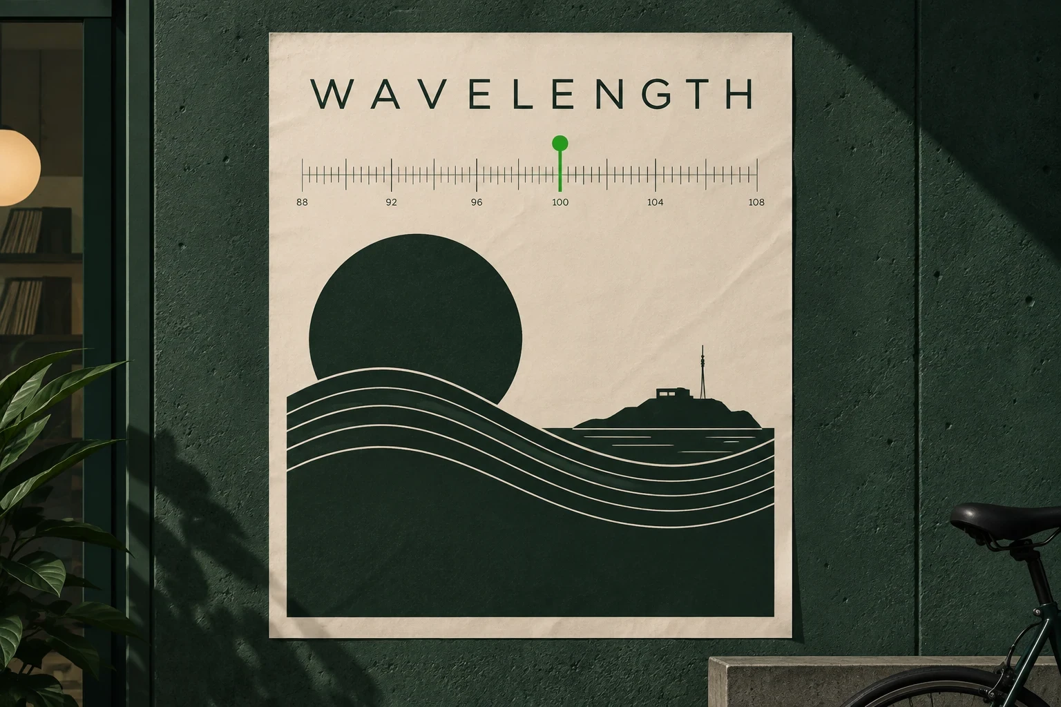
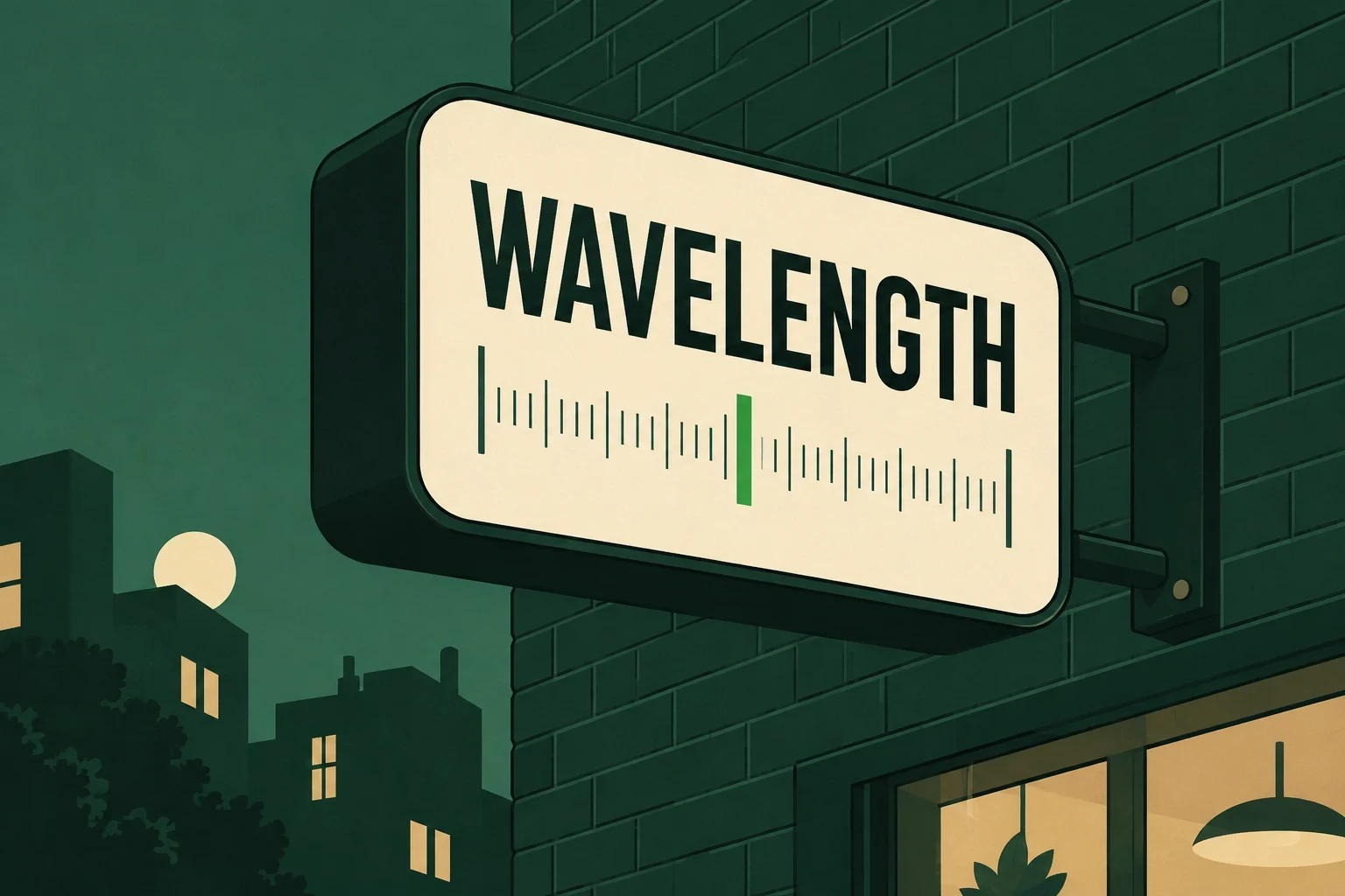
A radio platform whose interface moves the way the audio does.
Project Info
Client
Wavelength FM
Year
2024
Discipline
Motion
Wavelength FM streams independent radio from forty cities, and in 2024 its app still looked like a podcast player with the wrong logo on it. Listeners could not tell a live show from an archived one, and nothing on screen suggested anything was playing. We were asked to make the interface behave like the thing it carries.
Sound with nothing to look at
Radio is invisible. Every other part of the product had something to show, a photograph, a schedule, a city name, but the audio was only a progress bar. The brief was to give listening a physical presence: waveforms as navigation, levels as feedback, silence as white space.
Underneath that sat a second problem. Wavelength runs live streams and an archive of recorded shows in one list, and the old interface treated them identically. A live broadcast has no end time and no waveform to scrub, so any control implying otherwise lied to the listener.
One signal, many surfaces
The decision that shaped everything was to drive motion from the audio, not from timers. One amplitude value is read from the stream sixty times a second, so the play button, the station tile and the now playing bar all breathe off the same source. Nothing is choreographed to a stopwatch, so the interface never animates confidently through a buffering gap.
Our first prototype pushed the idea too far. A full spectrum analyser ran behind the track list. It looked extraordinary for ninety seconds, until the text became unreadable and a test phone lost eleven per cent of its battery in half an hour. So we spent the signal more carefully: the height of one meter, the opacity of the station glow, and the weight of the scrub handle. Live shows get a slow breathing bar and no handle, because there is nothing to scrub towards.
What shipped
An interactive prototype covering twenty-four screens, built in code so timings could be tested against real streams, not mocked audio. With it, a motion specification of nine named behaviours, each with a duration, an easing curve and a rule for network drops. The waveform scrubber, the station browser and the now playing bar went over as working reference code.
They also received a token set for durations and easings that maps onto their design system, reduced motion equivalents for every behaviour, and a recorded walkthrough for the two engineers who maintain the player. The build ran eleven weeks.
What we took away
Average session length rose from fourteen minutes to twenty-three in the first quarter after launch, and the share of archived shows played to the end went up by a quarter. The lesson is smaller than the numbers. Motion earns its place when it tells the truth about system state, and the moment it performs on its own schedule, people stop trusting the screen.