Lumen
Lumen Works
Identity
2026
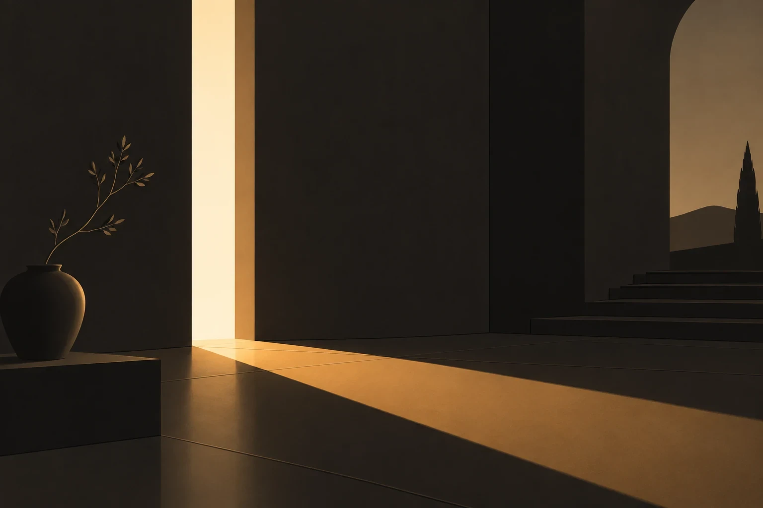
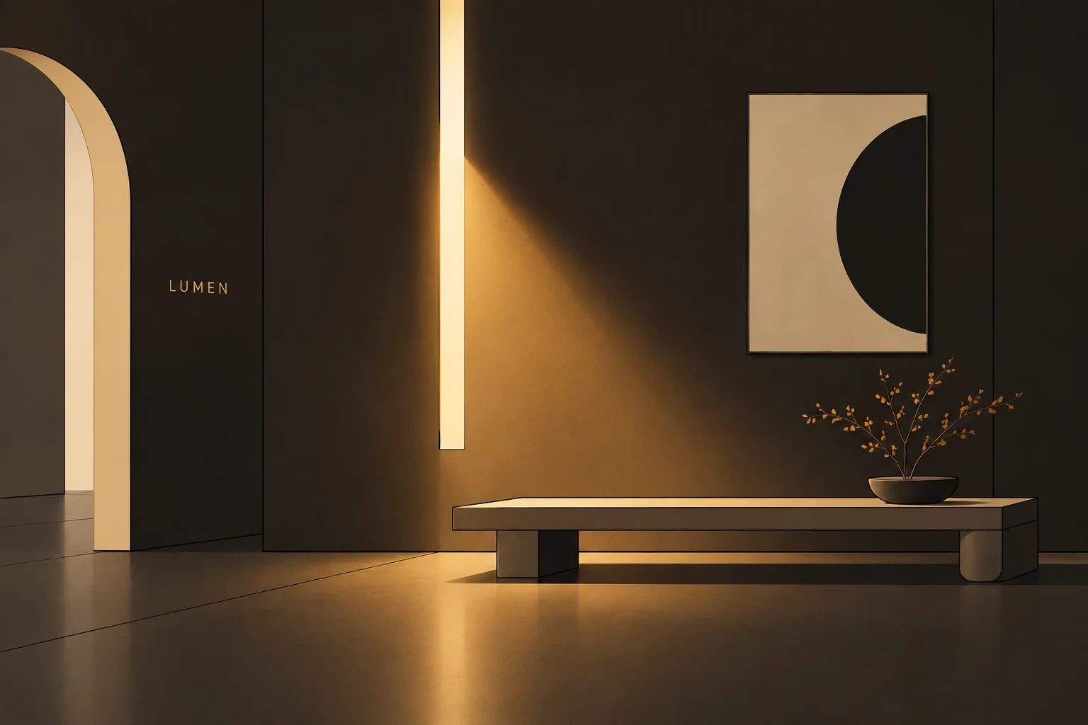

A lighting label with a mark that behaves the way light does.
Project Info
Client
Lumen Works
Year
2026
Discipline
Identity
Lumen Works builds architectural lighting for galleries and homes, fittings you are meant to notice only as light. They arrived with a catalogue that photographed beautifully and a brand that said nothing about it. We designed an identity around one idea: the mark is a light source, and every surface it touches reacts to it.
The brief
The old brand treated light as a product photo. Lumen needed a system where glow, falloff and shadow become the brand language itself, from packaging to the configurator.
The range covers 40 fittings across four families, from a 12 millimetre track spot to a two metre pendant, so one identity has to hold on a gallery wall label and on a delivery van. Curators specify Lumen precisely because the product stays out of the way, and a loud brand would have argued with the proposition.
Building a light model
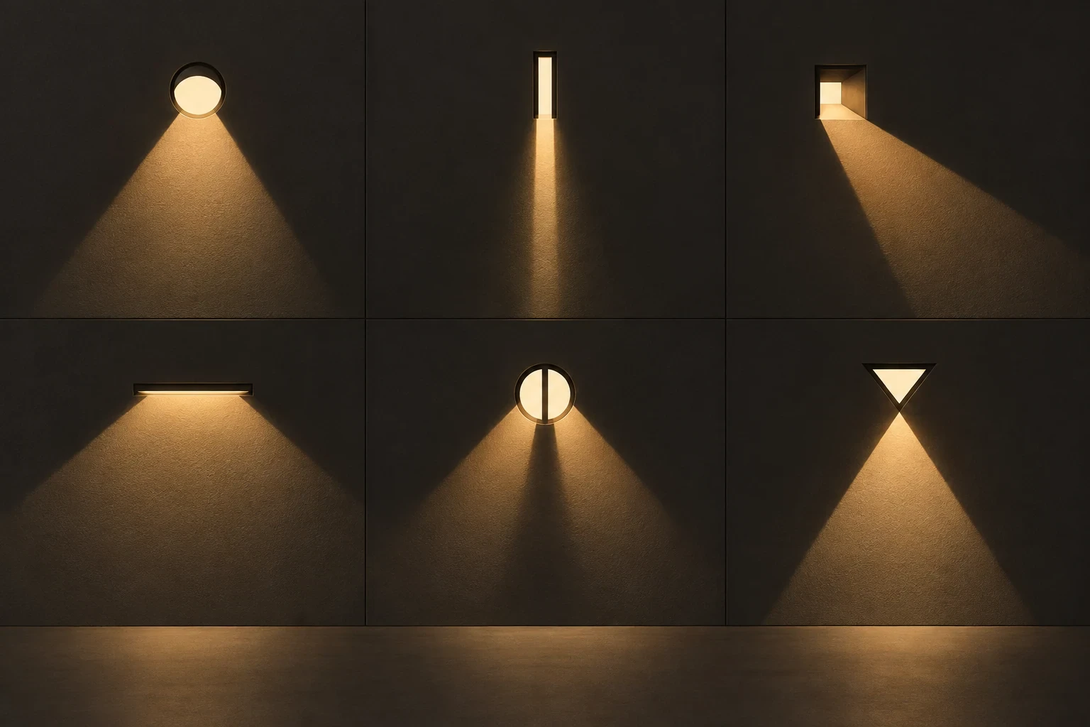
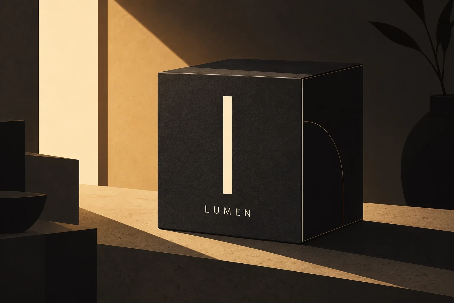
We decided early to treat the identity as a light model rather than a set of assets. We wrote one specification: a single source position, one intensity curve, one warm shadow, applied to the wordmark, the photography, the print and the configurator scene alike. Questions that normally cost a week became arithmetic. Nobody decided how a badge sits on a dark box; they looked up the angle.
Print kept us honest: glow is free on screen and expensive on board, so anything we invented had to survive four colour litho on uncoated stock without varnish or foil. Our first mark was a soft radial bloom that looked convincing in the deck and turned to mud on the press proof. We rebuilt it as a solid geometric form with one hard-edged shadow, letting the shadow carry the light. Colour followed: pure black gave way to a warm near black mixed from that shadow, because true black reads as absence, not a lit room.
What shipped
A wordmark and monogram drawn to hold at both a 6 millimetre blind emboss and a four metre trade stand. A type system in two weights, plus a mono for specifications. The light model itself, an eleven page document of angle, intensity and shadow values for print, screen and film. Packaging artwork for all four families, on a die line that still reads when the box is stacked on its side.
We also supplied the configurator materials and lighting presets, a photography direction for studio and installed shots, and templates the team now uses for spec sheets and price lists.
What we took away
Lumen relaunched in March 2026. Trade enquiries through the configurator rose by a third in the first quarter, and the sales team stopped attaching separate photography to quotes. The better result was internal: because the light was written as a specification rather than a mood, Lumen’s own designers extended the system across two new collections within six months without asking us how the shadows should fall.