Halden
Halden Studio
Web
2024

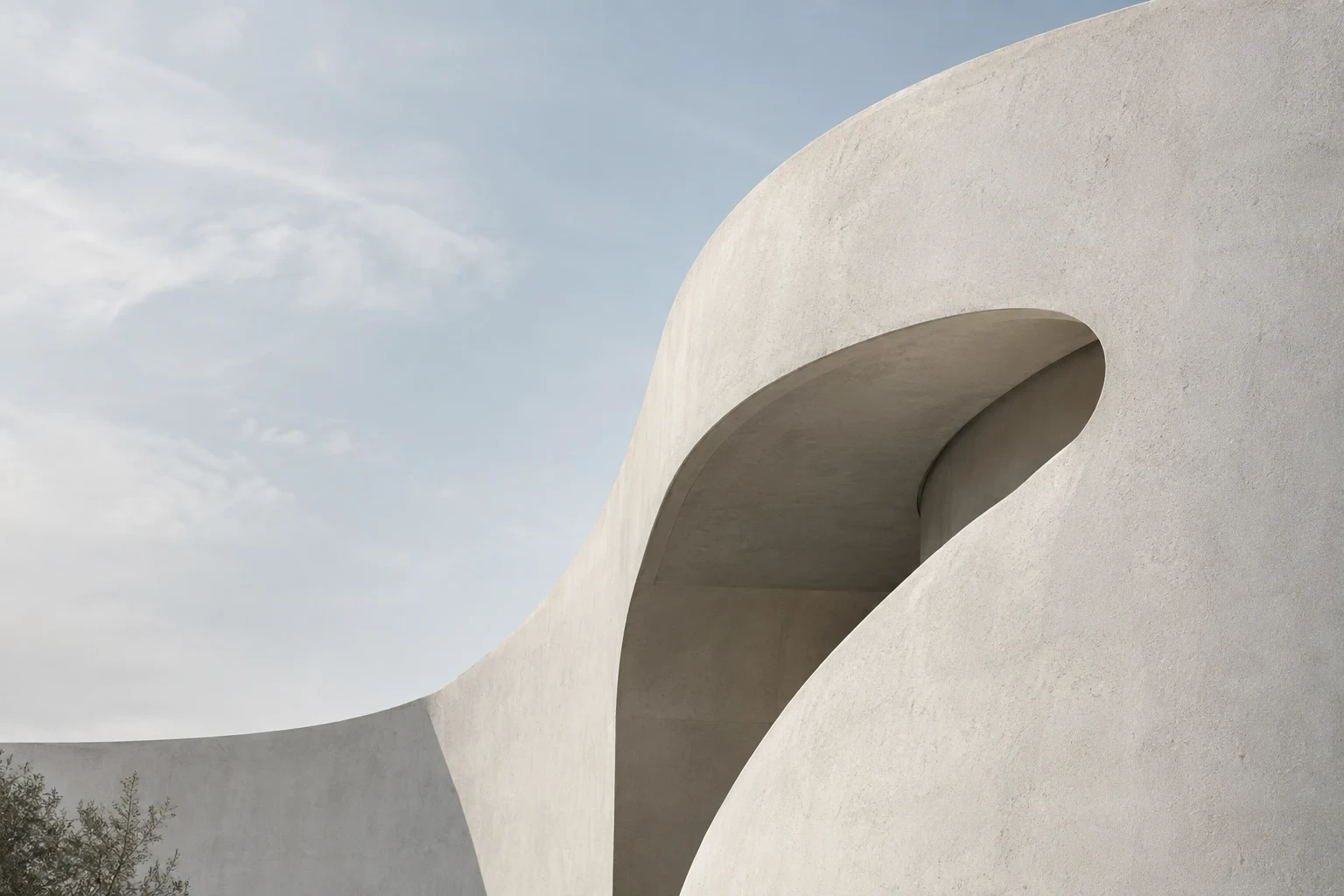

An editorial site for an architecture practice, built so the drawings carry the page.
Project Info
Client
Halden Studio
Year
2024
Discipline
Web
Halden Studio is an architecture practice whose drawings deserve more room than a standard portfolio grid gives them. Their old site compressed twelve years of sections, site plans and hand studies into a wall of 400 pixel thumbnails, and the partners had stopped linking to it. We built an editorial site where the work sets the pace.
The brief
Most architecture sites treat drawings as thumbnails. Halden wanted the opposite: full-bleed plates, generous captions, and a reading rhythm closer to a monograph than a feed.
The site also had to function as a working archive. Partners send project links to planning committees and journal editors, so every page had to load quickly on a meeting room connection and print cleanly to A4. Eleven built projects and thirty one competition entries had to sit inside one structure.
Designing around the drawing
We started from the drawings rather than the layout. Every image in the archive was measured first, which turned up three recurring proportions: the tall section, the wide site plan and the near square interior photograph. Instead of forcing those into a single frame we built three plate types and let each project sequence them freely. The decision added a week to the build and removed every awkward crop from the archive.
File size shaped the rest of the work. Scans arrive at 300 dpi and run past 40 megabytes, and Halden would not accept losing linework. Our first attempt used a deep zoom viewer serving tiles, which held the detail but broke the reading rhythm: people stopped scrolling and started pinching. We dropped it and built a two stage loader instead, serving a sharp 2400 pixel plate on scroll with the full resolution scan one tap behind it. Fine line weights survive, and pages still settle in under two seconds.
What shipped
A custom editorial layout system with three plate types, a caption scale that runs from single line credits to 200 word project notes, and a CMS the studio updates themselves. Project pages assemble from a small set of blocks, so a partner can publish a competition entry in twenty minutes without calling us.
We also delivered a print stylesheet for A4 and A3, an index that filters by programme, year and status, and type and spacing rules documented in the same CMS the team writes in. The site runs on the practice’s own domain with nothing installed beyond image handling.
What we took away
The archive stopped being the thing Halden apologised for. In the six months after launch, average time on a project page rose from 40 seconds to just over three minutes, and two of the four competition invitations that arrived that year mentioned drawings the practice had only published there. The lesson we keep is plain: when the work is the argument, the layout’s only job is to hold the page steady.