Six Weeks to a Brand
Process
8 min read
~/blog/six-weeks-to-a-brand
The calendar as creative director
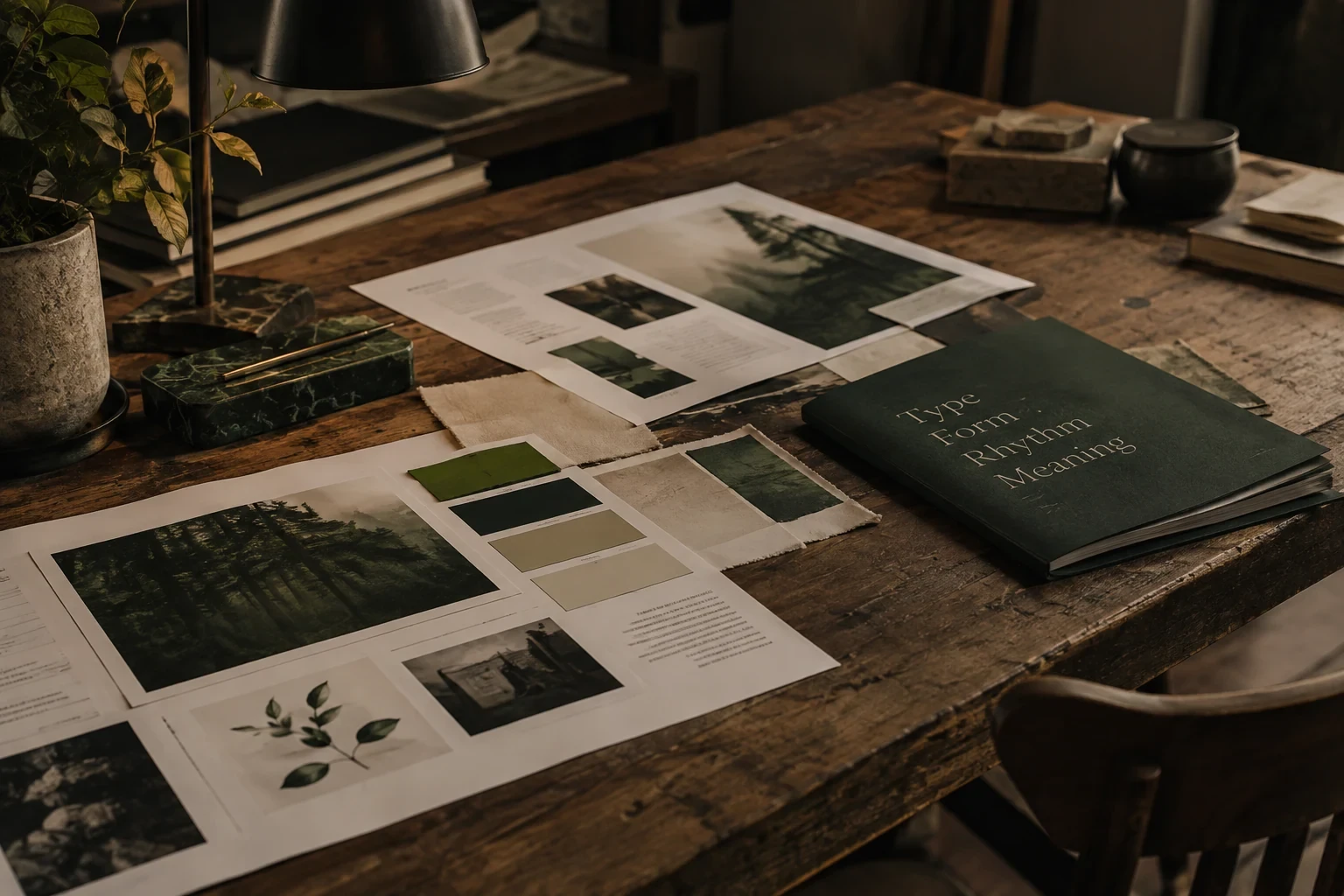
When a brand has to ship in six weeks, scope stops being a negotiation and becomes a design material. We cut the deck of deliverables to the four that move a launch: a wordmark, a type system, a colour logic, and one flagship application done properly. Everything else is a derivative, and derivatives can wait.
Compression also forces honesty in the process. There is no room for three rounds of moodboards, so the first week is spent almost entirely on questions. The better the brief, the fewer directions you need. We aim for two, both of which we would be happy to ship.
Week by week
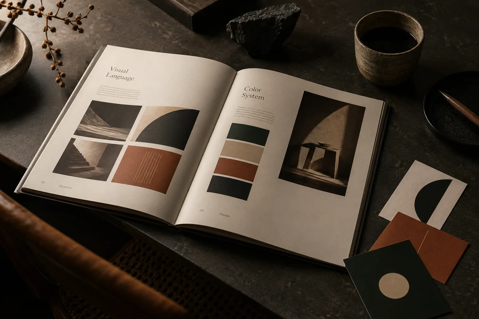
Weeks one and two are interrogation. No moodboards, no fonts: just questions, transcripts, and a growing document of things the client said when they thought they were off topic. The brief writes itself out of those margins. By Friday of week two we can say what the brand must never look like, which is worth more than a hundred references.
Week three is the fork: two directions, built to the same depth, each with a wordmark, a type pairing, a colour logic and one hero application. Not three directions, not five. Two, because a real choice has stakes and a menu invites committee thinking.
Weeks four and five build the chosen direction outward into the system nobody applauds but everybody uses. Grids, spacing, the boring second weight of the typeface, the error-state red. Week six hands over files, a one-page constitution, and a recorded walkthrough, because a brand that needs its designer in the room is not finished.
Where speed hurts, and where it helps
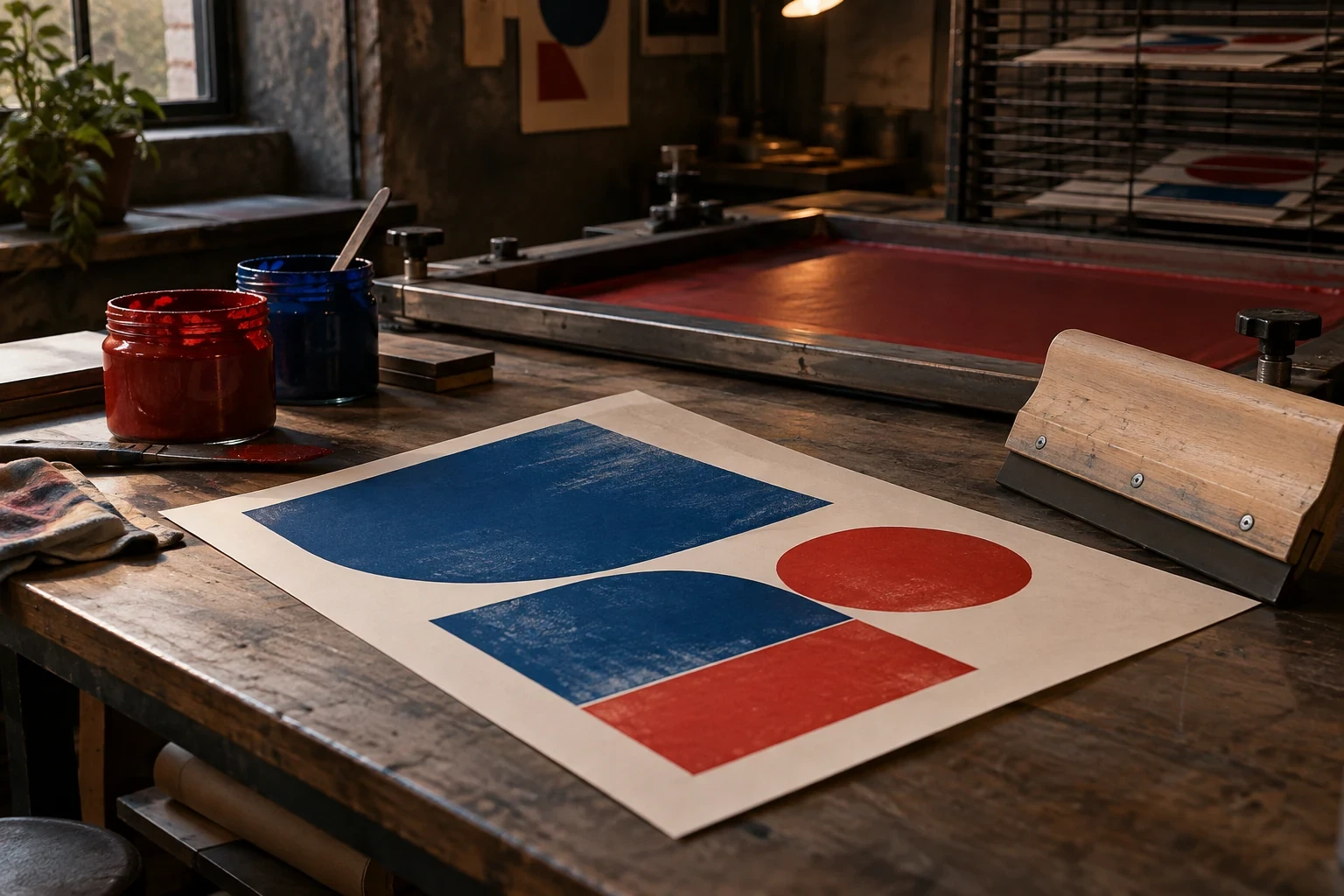
What suffers under compression is ornament. There is no time to hand-letter alternates or chase a bespoke icon set, and the work is usually better for the missing garnish. What thrives is decision quality: with one review per week, feedback arrives consolidated instead of as a drip of small reversals.
The honest caveat is that six weeks assumes a decider, singular. The schedule has never been broken by design problems, only by approval architecture. We now ask about the org chart before we ask about the audience.
Speed, it turns out, is a filter for conviction on both sides of the table.
What survives the sprint
Oddly, the six-week brands age well. Speed strips away the ornamental layers that date fastest, and what remains is structure. Structure is timeless; garnish is not.